Thursday 19 December 2013

Post 8

Live Brief

I have decided to follow up on a live brief suggested to me by my tutor.  To design a range of greetings/ stationary products.  It will be different working with a much smaller scale.  I aim to choose a different colour scheme for this. I need to choose a company which I would theoretically be making them for, and so this made me think back to Top Drawer – a trade show I visited in September at Earls Court Olympia in London.  It is the ‘UK’s leading event for design-led gifts, lifestyle & fashion accessories’.  Art Angels Publishers who I saw there really appeal to me; they publish a range of cards and stationery products.  The wide collection of designs they use are focused on images produced by printmakers.  Artists they work with include some of my favourite printmakers such as Edward Bawden, Mark Herald and Angie Lewin, all of whom work with wood block/ lino printing.  As my designs are quite pattern based rather than illustrative, they will probably be suitable for gift-wrap and notecards.
Art Angels Publishers at trade showhttp://www.art-angels.co.uk/cat/trade-exhibitions
Notecards by Angie Lewin 
Notecards by Mark Herald and Angela Harding

Thursday 12 December 2013

Post 7

Some scans of my prints so far
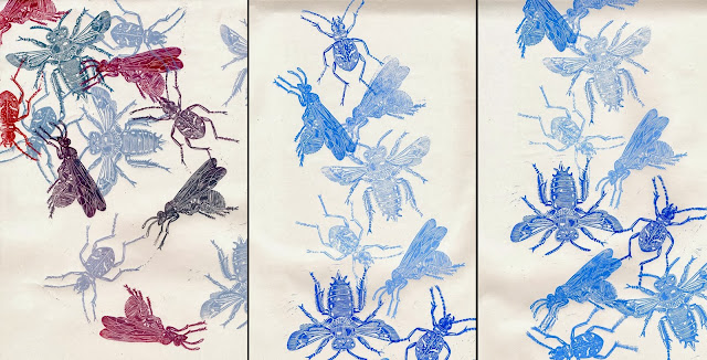
To give myself more freedom, I have been using masking tape and paper to block off areas while printing; this has been successful in breaking up the busy pattern and showing more stencilled background.  I realised I could also combine prints this way. (see picture below)
Process of blocking off circles an printing in the gaps
Printing through lace-effect plastic net, 
this was too thick and left a mark in the wood itself

Sunday 8 December 2013

Post 6

I need to consider the scale of the designs I use because so far they might be a bit too small for large areas of wallpaper, especially the insects.  As I am only printing on a small scale I think I have tried to make my woodcuts as busy as possible to fill the space and make it interesting, however over a large area, I understand that much simpler designs would be clearer and stand out more.

I think the wallpaper designer and illustrator Dan Funderburgh gets the scale right because he uses larger main shaper with smaller details inside, therefore it is just as effective from a distance as it would be up close.
http://www.danfunderburgh.com/wallpaper.php#
I have looked at some old printing blocks and I have noticed how the edges curve around the shapes.  Since I have started doing repeat pints, I have found that joins are quite difficult to achieve and I think it would be much easier if the ends are not cut off in a dead straight line, so the joins would not be so obvious; however I have noticed that the joins are sometimes fairly noticeable in Marthe Armitage’s prints, and I think this adds to the uniqueness and could even be seen as a sign of authenticity.

I have started painting the backgrounds with Annie Sloan chalk paint which gives the paper more of a texture. I have also cut stencils to combine with the prints to add more depth and colour.  The backgrounds could potentially play just an equally important part as the block prints, changing the colour behind the print completely alters the mood of the design.

Some more prints using insect blocks

Presentation Reflection
The presentation process helped me to sum up and reflect on my project so far and also to collect up-to-date photographs of my work.  I introduced clearly the inspiration behind my project and how exhibitions and gallery’s I had visited during the summer influenced the direction my work was taking. I clarified that my aim was to produce a collection of hand block printed wallpaper samples and I briefly explained the processes and tools I use to create my work and how my project began with experimental mark making.  I also explained some decision making processes I went through such as the type of wood I found easiest to carve.  I explained the difficulties I overcame such as the choice of imagery to use initially and the problems I had when learning to use the Columbian press this year and how I learned to resolve these issues and how the flaws and imperfections that happen along the way can add to the handmade look which I realised was part of the nature of wood block printing.  I included three appropriate contextual references and I think I demonstrated an outward facing approach by mentioning how I had researched professional open-access printmaker’s studios and how these could allow me to continue printing after we finish without having to buy my own press.

The review point definitely helped me to clarify what I needed to do to progress and what I wanted to investigate, for example I thought that making visualisations of my prints in an interior setting could help me to work out if my designs would be a suitable scale for wallpaper.  I think overall my visual presentation worked cohesively with what I was describing.

Saturday 16 November 2013

Post 5

Ernst Haeckel
For the major part of the project I decided to pursue the theme of natural forms and I came across the works of Ernst Haeckel, a 19th century biologist and immediately felt inspired by his wonderful collections of sea creatures, in particular the contrast between the structured look of the micro-organisms called radiolarians and the more free-flowing ones.  I am interested in the structural variations of natural forms and combining them in my next prints.  I am also still very much working on the technical aspects of the printing.   
Breidbach, O. (2006) Visions of nature: the art and science of Ernst Haeckel, Munich; London: Prestel
My drawings
I think stripes will be good for wallpaper, as only the top and bottom of the design have to join up and I wanted to do a detailed carving that I could choose where to position on the wallpaper, rather than having an all over design like the repeating insects.  There are several different ways I could use these blocks, such as rotating them, overlapping, having the stripes in different directions; I also want to try printing through net to see what effect that has. 

Printing on the Columbian Press
Colour Palette
I now want to decide on the colours I will be using, as the imagery so far is all quite different apart from having a theme of natural forms, I am hoping that a colour palette of around 5 colours will bring my designs together.  I need to start thinking about the backgrounds of my wallpaper, that means either buying some already coloured wallpaper, painting my wallpaper with roller and paint or screen printing flat colour onto the background.

I have varnished my blocks with shellac to protect them and tried oil based inks for the first time, I am pleased with the results and think they have a stronger finish compared to the water based inks I have been using, it also seems to be effective on fabric and is colour-fast.  I have started printing on ‘Paste the wall’ lining paper by Graham and Brown, it is not like any other paper I have seen before, it feels like half fabric and half paper and I am pleased that it is not as fragile as the thin lining paper I have been sampling with.

Visit to the Victoria and Albert Museum Print and Drawing Study Collection
The older prints I saw there often had built up layers of stencil combined with block print, I need to experiment with this as it could give a whole new dimension to the block print.  I thought block printing might be very limited, but this is definitely not the case.  In some papers, many different blocks were layered to create different shades in a single image.  I was inspired by the chalky texture of the paint and I would like to achieve this effect.

Thursday 24 October 2013

Post 4

Planning a print
Carving in progress
First Repeat Pattern Print
The Columbian Press

I wanted to investigate the possibilities of using some kind of printing press as I have been using other ways of burnishing the print, such as rubbing the paper on the wood with the back of a wooden spoon, and simply using my hand, I saw printmaker Merlyn Chesterman (below) using this method at Art in Action in Oxford.  

I located the fine art printing room where I was introduced to the extremely impressive Columbian press which is over 175 years old.  I was given and induction to the printing room and how to use the equipment.  My first carving was unfortunately too thick to fit in the press which was a bit of a let-down but I used another block to learn how to use it and how to pad the press out to get enough pressure.  The physical action of using the press feels a long way from sitting at a sewing machine or designing at a desk, I like the physical activity needed to produce a print.  
What I learned from using the press:

1   To carve deeper lines and use less detail as fine lines seem to get blocked with ink after about 8-10 prints and images start to look less sharp and more blobby.
2   mix colours more carefully and don’t use a new colour on an already inked block without cleaning it.
3   plan designs before printing, maybe with small sketch
4   cut away background of carving or will leave an impression of the wood even without ink
 use the right amount of pressure, always print in the middle of the press for even prints, don’t forget to reposition paper or it will look very patchy, although I think this effect could be used in small amounts to add to the handmade look.  

Visit to Special Collections
I examined a number of printed papers from the Schmoller Collection, most of which were decorative papers used for covering books, lining draws and edging shelves.  I was inspired by the different patterns, colours and playful designs.

Saturday 12 October 2013

Post 3

Imagery
I found it difficult to think of original imagery to use in my prints, I was very keen to find something different and unique, I really could have continued to deliberate over this for the rest of the term, however in order to physically make a start I pushed myself to choose a subject.   A trip to Manchester University Museum gave me the inspiration I needed.
As a starting point for the minor project I am looking at the complex structure of insects as there is potential for interesting shapes and detailed texture to carve.  I feel more involved with technical considerations at this stage in the project.  I intend to expand on and experiment with the types of imagery I use during the major project and be more selective with my choice of subject, as it has been pointed out to me that insects on a wall are not to everyone’s taste, however I was hoping not to make conventional wallpaper, so for now I am happy with the imagery.

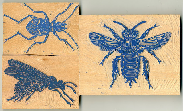
I have carved a set of three individual insects which I can use to form a number of different print designs.  I have experimented with some different layouts on strips of wallpaper.  I think they are more effective when they are crowded together rather than in isolation.  I am pleased with how my carving technique is improving. 
Following on from this week I feel that I am up for the challenge of carving a larger repeat pattern.  I have decided to design a collage of insects overlapping and interlocking, the individual insects won’t stand out as clearly so it will appear more like a mass of detailed pattern with balanced areas of dark and light.  

Marthe Armitage
I have found it quite difficult to find other people working in a similar way, although this gives me confidence that what I am doing is somewhat unusual and inspires me to pursue it.  One of my main inspirations is Marthe Armitage who block prints wallpaper using her hand cut lino blocks.  I first came across her work on the ‘Fabric of Britain’ series on wallpaper on the BBC.  She looked very involved in her work and she had obviously found something that she really enjoyed doing, which she had also made into a successful business.

Her large lino cuts are mostly 21 inches, covering the width of the wallpaper; this is something I could possibly aim to do in the future. There are a lot of technical aspects I need to consider, but I enjoy that kind of challenge and want to take time to find the most effective way of printing with wood.  At this point I do not know exactly what type of printing machine I will need.  I admire Armitage’s determination to work for herself and see the process through from beginning to end.  I aspire to have a similar outlook and really try to make a success of working for myself in the future.

From looking at Armitage’s work I realised that wallpaper does not need to cover a whole room, a feature wall on its own can be very effective and eye catching, like the one below which Marthe Armitage printed for High Road House Hotel in London.
http://www.house.highroadhouse.co.uk
Wallpaper printed by Marthe Armitage
House and Garden, November 2013

Saturday 5 October 2013

Post 2

Mark making
My first prints:  Hammering different objects into wood to create marks
After my first attempt at carving I found that I was very restricted by not having the right tools so I decided to invest in some finer tools which have made a huge difference and given me a greater choice of marks that I can make.

Through looking at other people’s work and wood carving guide books I realised that there are endless types of marks and textures that can be created in the wood and was eager to experiment with these.
I have found that one of the best woods for carving is seasoned lime wood, as it is both soft and dense, so much easier to carve compared to other types of wood that I tried.  After contacting numerous wood suppliers, I managed after a lot of searching to locate a specialist timber merchant from whom I was able to buy a small amount of lime wood.
I did not want to limit myself to one subject immediately and I wanted to express something of myself in a design, so during my first week I worked on an image in which I tried to show contrasting imagery of countryside and city.  I travel regularly between the two and I am always struck by the huge contrast.  I want to at some point challenge myself by carving a larger repeat pattern block, but as I did not yet have the confidence I decided to contain the image within another shape ie. a circle. The circle reminds me of the view seen through a pair of binoculars. 

Wednesday 2 October 2013

Post 1

Starting Third Year

During the summer holidays I visited several exhibitions, galleries and museums and I became increasingly interested in hand block printing.  The hands on process really appeals to me and the challenge of learning this new technique.  The detailed woodcut prints by Albrecht Durer in the Whitworth are extremely impressive; it is hard to believe that he could achieve such detail.  I saw Merlyn Chesterman demonstrating how she made her large lime wood prints at art in Action in Oxfordshire, and later I saw the same print at the Royal Academy Summer Exhibition along with several other block print artists; this gave me the confidence to believe I had found something I could feel passionate about doing.   I visited New Designers in London and realised how much digital work was on show and this made me even more determined to pursue a hand process.   As I have previously focused more on embroidery my knowledge of printing is limited so I started to look at different prints both traditional and modern.  The idea of doing something original in print is very daunting because everything seems to have been done already. I want to be open-minded at this stage and not restrict myself. 

Aims
My aim at this stage is to design and make a portfolio of bespoke hand block printed wallpaper samples.  I want to develop the techniques I began to explore during the summer holidays and I want to pursue my passion for being hands on with my work rather than using digital processes.  My aim is for an interior context and my target market is people looking to own pieces that are individual and unique; something they could not find in a local high street shop.  My audience is someone who desires to own something different that has been hand-made and they can be proud to display.

I will be exploring a variety of ways to construct a printed piece using carved wood blocks.  I will experiment with size and proportion and a number of different design layouts.  I will research older methods of wood block printing and carving as well as more modern techniques. Finding the best tools and wood to use, the correct printing inks, and suitable papers will be important.  

my photos of inspiration from summer holidays
Albrect Durer in the Whitworth
& John Bryce at the Royal Accademy Summer Exhibition
Mokhlesur Rahman large prints on silk scarves at Venice Biennale
& Japanese wood block prints at Ashmolean Museum Oxford
Merlyn Chesterman at Art in Action, Waterperry, Oxfordshire
Hand Block printed French wallpaper c.1760 & c.1790
Whitworth Gallery